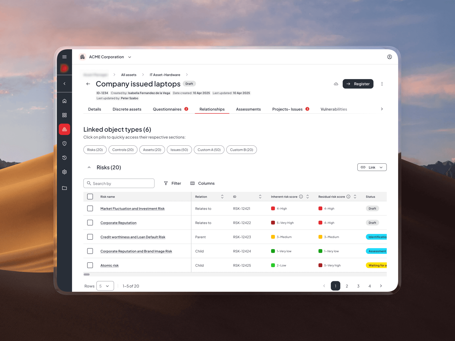
Making relationships visible across systems
Role
Product Designer
Role
Product Designer
Year
2025
Year
2025
Category
Web, Saas
Category
Web, Saas
The context
Relationships are core to how users navigate enterprise governance, risk, and compliance (GRC) work — connecting risks, controls, processes, issues, and assets so people can understand how different parts of their organization affect each other.
This capability existed across multiple products, but it lived inside a single object view — and as data volume grew, that structure could not keep up.
The problem
As data volume and organizational complexity grew, the existing relationships experience could not keep pace.
Users struggled to link objects, lacked visibility into relevant data, and found it difficult to trace connections across products. The feature held up in simple setups but broke down in complex, high-volume environments — exactly where it mattered most.
This was not a cosmetic problem — it called for rethinking how relationships were structured and interacted with, not just how they looked.

David Miller
David Miller
“When linking objects, I only see the name and ID.. I don’t have enough context to know if I’m selecting the right one
“When linking objects, I only see the name and ID.. I don’t have enough context to know if I’m selecting the right one

Laura Carlson
With large datasets, the card view just doesn’t work — I have to scroll a lot, and I still don’t see enough information.
Laura Carlson
With large datasets, the card view just doesn’t work — I have to scroll a lot, and I still don’t see enough information.
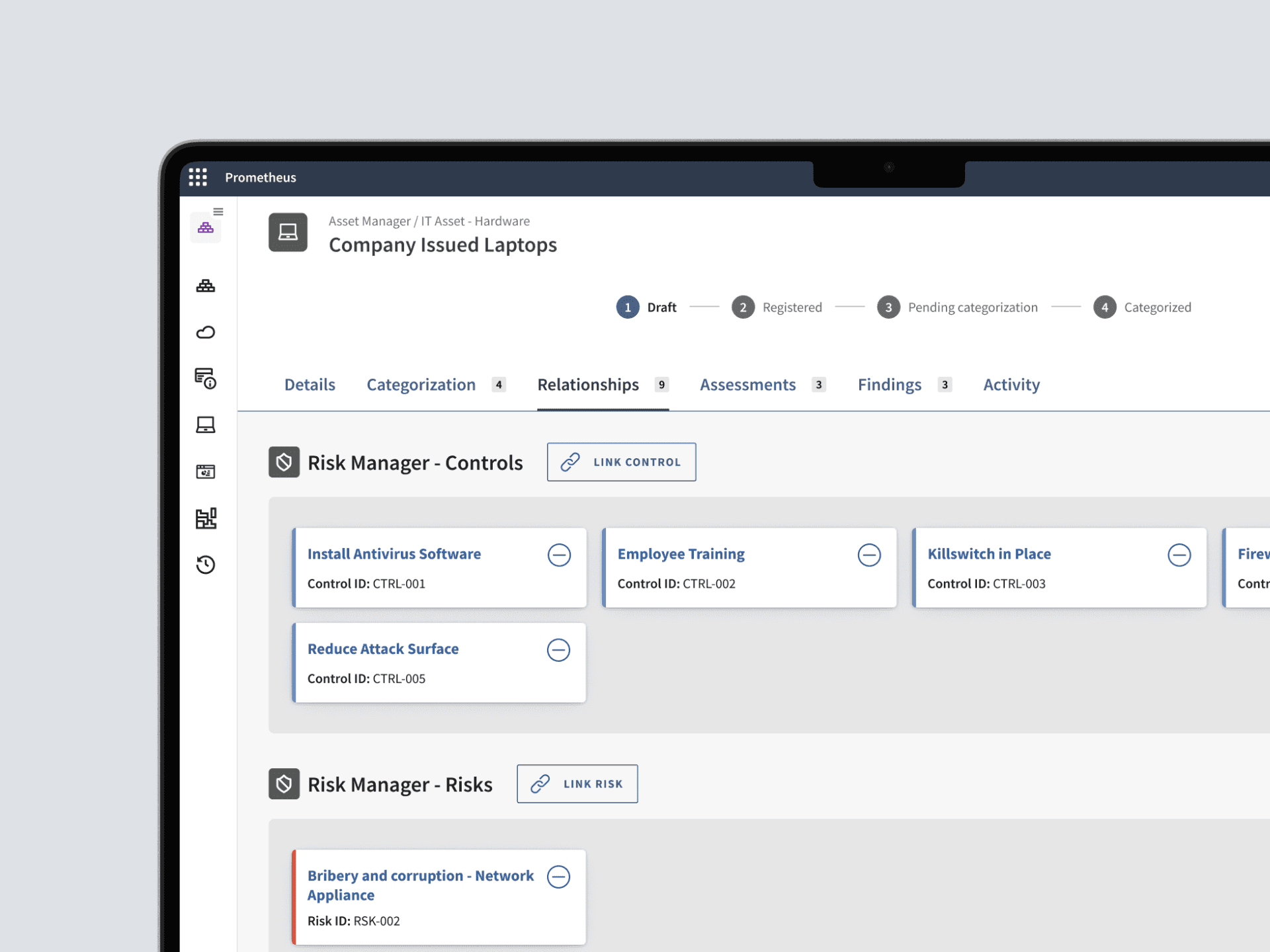
Existing relationships tab.
The opportunity
The opportunity was to design a system that could scale with complexity rather than resist it — one interaction model that worked whether a user was managing a handful of relationships or thousands.
1
Designed for scale
The solution needed to work equally well for simple use cases with a few objects and for complex scenarios involving hundreds of relationships.
3
Effortless linking
Linking needed to become more intuitive and informative, allowing users to confidently connect objects without navigating back and forth or relying on limited information.
2
Context at a glance
Users needed more than just names and IDs — the experience had to surface key attributes upfront to enable faster understanding and decision-making.
4
Consistent across products
Since the Relationships tab is used across several applications, the solution needed to function as a scalable, reusable pattern that ensures consistency while supporting different use cases.
1
Designed for scale
The solution needed to work equally well for simple use cases with a few objects and for complex scenarios involving hundreds of relationships.
2
Context at a glance
Users needed more than just names and IDs — the experience had to surface key attributes upfront to enable faster understanding and decision-making.
3
Effortless linking
Linking needed to become more intuitive and informative, allowing users to confidently connect objects without navigating back and forth or relying on limited information.
4
Consistent across products
Since the Relationships tab is used across several applications, the solution needed to function as a scalable, reusable pattern that ensures consistency while supporting different use cases.
My responsibilities
I owned the design end-to-end, from discovery through delivery, partnering closely with product management and engineering across every team that shared this feature. Because the feature spanned multiple products, a core part of the work was aligning stakeholders around one scalable interaction model instead of a one-off fix for a single team.
Synthesized customer feedback and pain points
Explored solution spaces through structured ideation
Designed and tested scalable interaction patterns
Delivered high-fidelity prototypes and supported development
How I started
Understanding the landscape
I started by mapping the broader ecosystem this feature lived in — across products, teams, and user groups.
This was not a standalone experience — before exploring solutions, I needed clarity on three things: who used it, how they used it today, and where it broke down.
How many applications are involved?
Which teams own or influence these areas?
What are the different stakeholder needs across these touchpoints?

What I learned
User interviews surfaced how relationships were actually being used, in practice, versus how the feature was originally designed to work.
01
The current experience doesn’t scale
Card-based layouts quickly become difficult to navigate as the number of relationships grows, leading to clutter and loss of overview.
01
The current experience doesn’t scale
Card-based layouts quickly become difficult to navigate as the number of relationships grows, leading to clutter and loss of overview.
2026
02
Relationships need context, not just links
Users need to see key attributes to understand what they are looking at — names and IDs are not enough.
02
Relationships need context, not just links
Users need to see key attributes to understand what they are looking at — names and IDs are not enough.
2025
03
Comparison is a core part of the workflow
Users actively compare related entities to make decisions, which the current experience does not support well.
03
Comparison is a core part of the workflow
Users actively compare related entities to make decisions, which the current experience does not support well.
2024
04
Consistency across contexts is critical
Although used across different areas, the experience needs to feel unified and predictable.
04
Consistency across contexts is critical
Although used across different areas, the experience needs to feel unified and predictable.
2023
The gap between the two was the real finding: this was not a single-screen usability issue, it was structural — the experience needed to scale with the volume of data people worked with, not just look better.
What I learned
User interviews surfaced how relationships were actually being used, in practice, versus how the feature was originally designed to work.
01
The current experience doesn’t scale
Card-based layouts quickly become difficult to navigate as the number of relationships grows, leading to clutter and loss of overview.
01
The current experience doesn’t scale
Card-based layouts quickly become difficult to navigate as the number of relationships grows, leading to clutter and loss of overview.
2026
02
Relationships need context, not just links
Users need to see key attributes to understand what they are looking at — names and IDs are not enough.
02
Relationships need context, not just links
Users need to see key attributes to understand what they are looking at — names and IDs are not enough.
2025
03
Comparison is a core part of the workflow
Users actively compare related entities to make decisions, which the current experience does not support well.
03
Comparison is a core part of the workflow
Users actively compare related entities to make decisions, which the current experience does not support well.
2024
04
Consistency across contexts is critical
Although used across different areas, the experience needs to feel unified and predictable.
04
Consistency across contexts is critical
Although used across different areas, the experience needs to feel unified and predictable.
2023
The gap between the two was the real finding: this was not a single-screen usability issue, it was structural — the experience needed to scale with the volume of data people worked with, not just look better.
What I learned
User interviews surfaced how relationships were actually being used, in practice, versus how the feature was originally designed to work.
01
The current experience doesn’t scale
Card-based layouts quickly become difficult to navigate as the number of relationships grows, leading to clutter and loss of overview.
02
Relationships need context, not just links
Users need to see key attributes to understand what they are looking at — names and IDs are not enough.
03
Comparison is a core part of the workflow
Users actively compare related entities to make decisions, which the current experience does not support well.
04
Consistency across contexts is critical
Although used across different areas, the experience needs to feel unified and predictable.
The gap between the two was the real finding: this was not a single-screen usability issue, it was structural — the experience needed to scale with the volume of data people worked with, not just look better.
Exploration
Exploring solutions across different scenarios
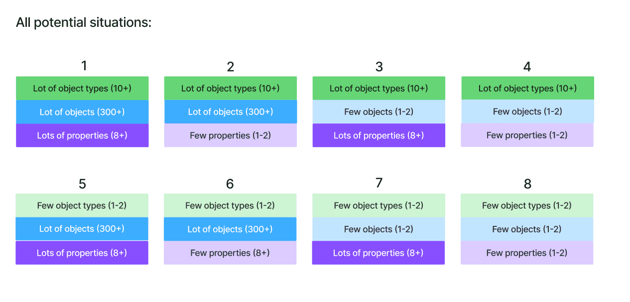
With a clearer understanding of the problem, I started mapping out different solution directions. Rather than optimizing for the average case, I mapped out multiple structural directions and tested how each one performed under real conditions.
The focus stayed on edge scenarios — large datasets, users comparing multiple relationships at once — the exact conditions where the current experience already broke down.
Few entity types with a small number of relationships
Many entity types with a small number of relationships
Few entity types with a large number of relationships
Many entity types with a large number of relationships
Exploration
Exploring solutions across different scenarios
With a clearer understanding of the problem, I started mapping out different solution directions. Rather than optimizing for the average case, I mapped out multiple structural directions and tested how each one performed under real conditions.
The focus stayed on edge scenarios — large datasets, users comparing multiple relationships at once — the exact conditions where the current experience already broke down.
Few entity types with a small number of relationships
Few entity types with a large number of relationships
Many entity types with a small number of relationships
Many entity types with a large number of relationships
Exploration
Exploring solutions across different scenarios
With a clearer understanding of the problem, I started mapping out different solution directions.
The goal wasn’t to find a single ideal layout, but to understand how each approach performs under different conditions.
Instead of designing for an average case, I focused on edge scenarios — where the current experience was already breaking down.
Few entity types with a small number of relationships
Few entity types with a large number of relationships
Many entity types with a small number of relationships
Many entity types with a large number of relationships
Narrowing down
Aligning on the right direction
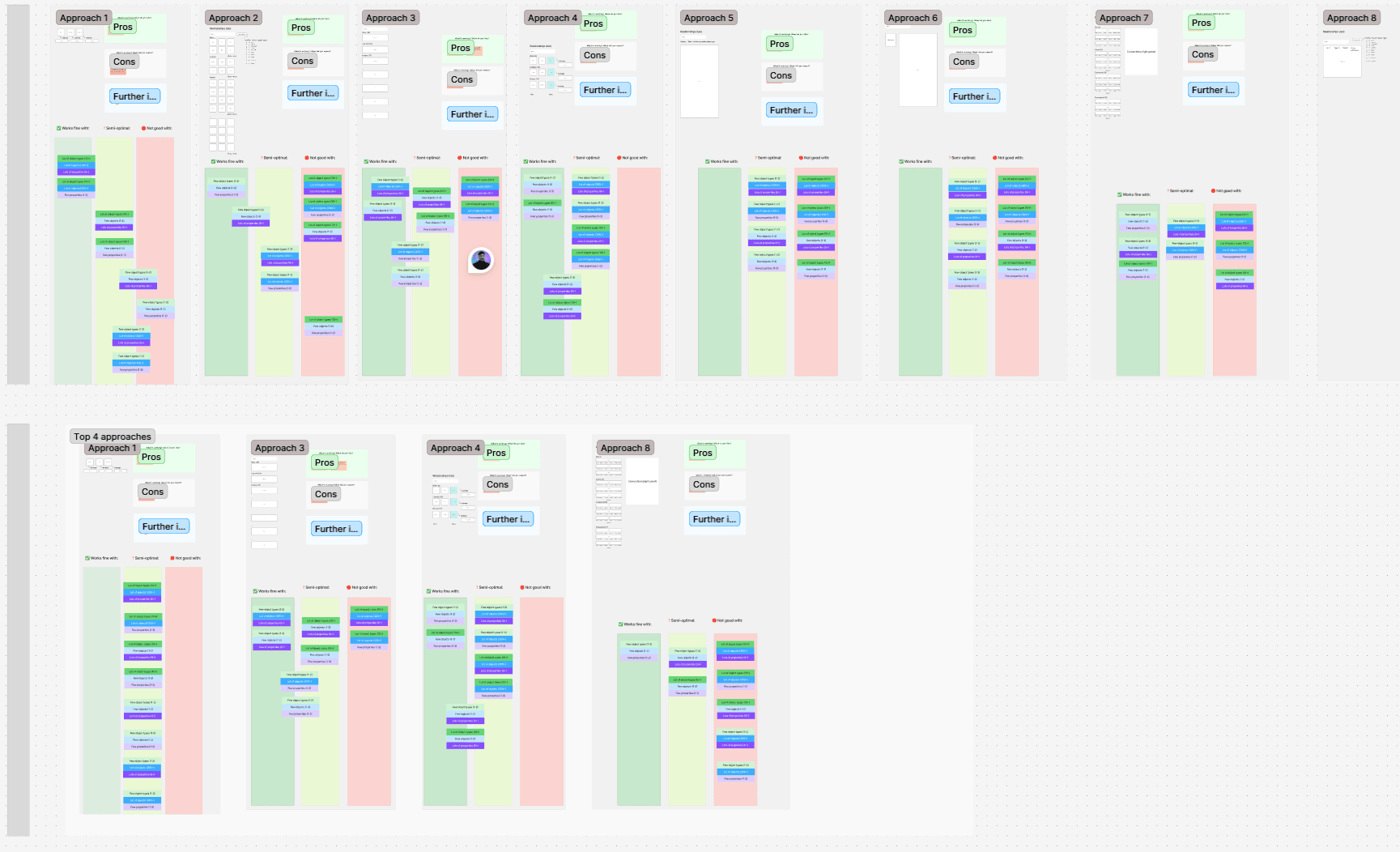
I brought the strongest concepts to a design review with the team, narrowing the field to two directions worth prototyping.
Decision points
We evaluated each direction based on:
How it performs with large datasets
How well it supports different entity types
The complexity and feasibility of implementation
Outcome
Based on this, I narrowed the focus to the most viable directions and moved forward with high-fidelity designs. Working at this level made it easier to validate not just the structure, but also the interaction details.
Narrowing down
Aligning on the right direction
I brought the strongest concepts to a design review with the team, narrowing the field to two directions worth prototyping.
Decision points
We evaluated each direction based on:
How it performs with large datasets
How well it supports different entity types
The complexity and feasibility of implementation
Outcome
Based on this, I narrowed the focus to the most viable directions and moved forward with high-fidelity designs. Working at this level made it easier to validate not just the structure, but also the interaction details.
Narrowing down
Aligning on the right direction
I brought the strongest concepts to a design review with the team, narrowing the field to two directions worth prototyping.
Decision points
We evaluated each direction based on:
How it performs with large datasets
How well it supports different entity types
The complexity and feasibility of implementation
Outcome
Based on this, I narrowed the focus to the most viable directions and moved forward with high-fidelity designs. Working at this level made it easier to validate not just the structure, but also the interaction details.
Validation
Prototyping and testing the concepts
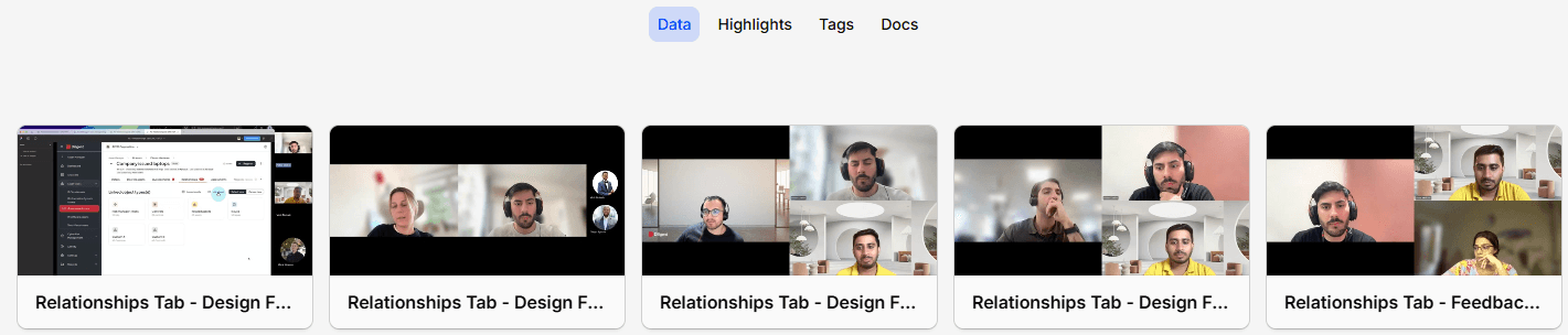
The two strongest directions were built out as high-fidelity, interactive prototypes.
Each was tested directly against the edge cases from research — large datasets and users comparing multiple relationships at once.
What I tested
The sessions focused on comparing the two approaches in real usage scenarios
Which layout feels easier to navigate
Which one makes relationships more understandable at a glance
Which approach better supports their day-to-day workflow
How easily users can compare information across entities
Which linking flow feels more straightforward and reliable
Validation
Prototyping and testing the concepts
The two strongest directions were built out as high-fidelity, interactive prototypes.
Each was tested directly against the edge cases from research — large datasets and users comparing multiple relationships at once.
What I tested
The sessions focused on comparing the two approaches in real usage scenarios
Which layout feels easier to navigate
How easily users can compare information across entities
Which one makes relationships more understandable at a glance
Which linking flow feels more straightforward and reliable
Which approach better supports their day-to-day workflow
Validation
Prototyping and testing the concepts
The two strongest directions were built out as high-fidelity, interactive prototypes.
Each was tested directly against the edge cases from research — large datasets and users comparing multiple relationships at once.
What I tested
The sessions focused on comparing the two approaches in real usage scenarios
Which layout feels easier to navigate
How easily users can compare information across entities
Which one makes relationships more understandable at a glance
Which linking flow feels more straightforward and reliable
Which approach better supports their day-to-day workflow
Outcome
Selecting the final direction
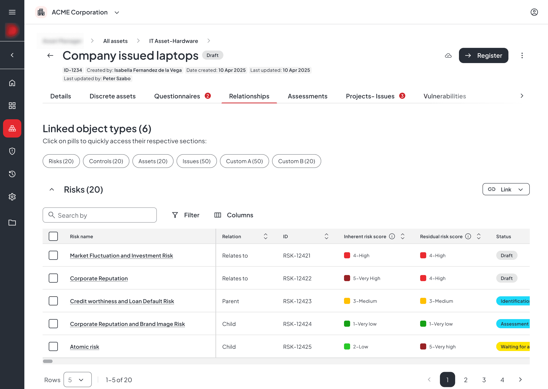
Testing results, synthesized in Dovetail, showed a clear pattern: one direction consistently outperformed the other in exactly those high-complexity scenarios — larger datasets and multiple simultaneous relationships — which became the basis for the final design.
Outcome
Selecting the final direction
Testing results, synthesized in Dovetail, showed a clear pattern: one direction consistently outperformed the other in exactly those high-complexity scenarios — larger datasets and multiple simultaneous relationships — which became the basis for the final design.
Outcome
Selecting the final direction
Testing results, synthesized in Dovetail, showed a clear pattern: one direction consistently outperformed the other in exactly those high-complexity scenarios — larger datasets and multiple simultaneous relationships — which became the basis for the final design.
Why this direction:
The selected direction gave users more control and visibility when working with relationships, removing the key limitations of the previous experience:
New structure — expandable tables
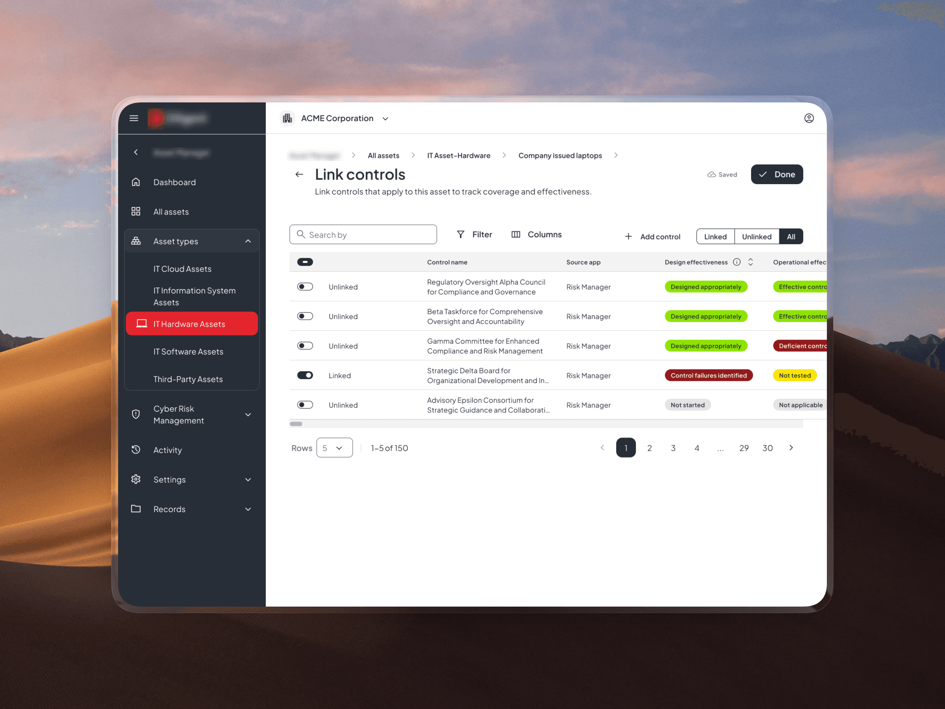
New linking method
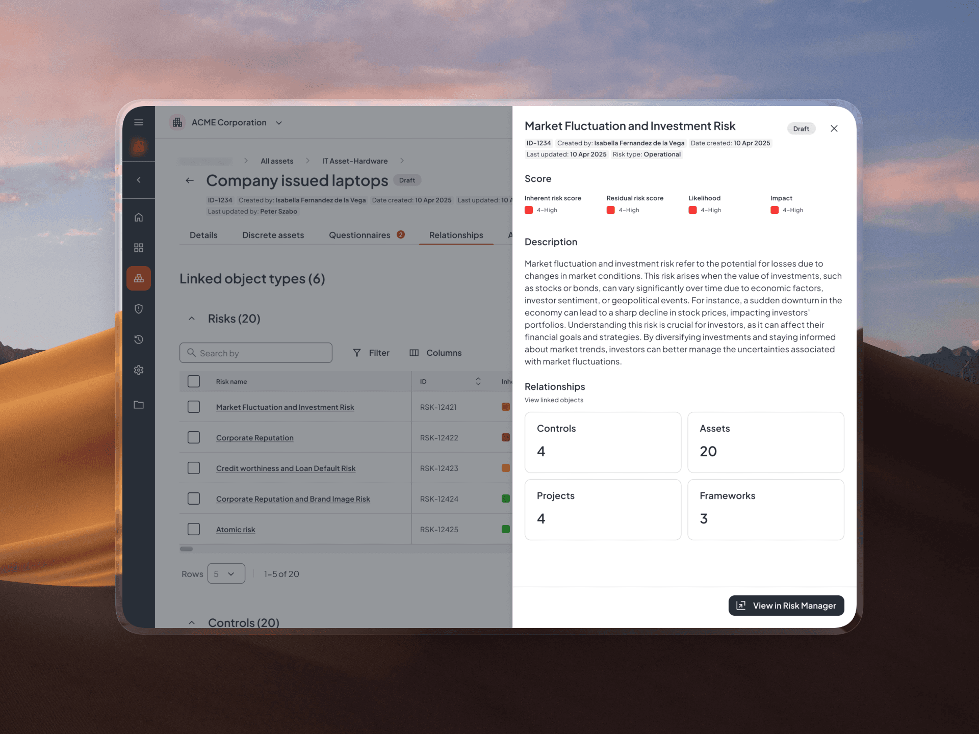
A new way to see related objects
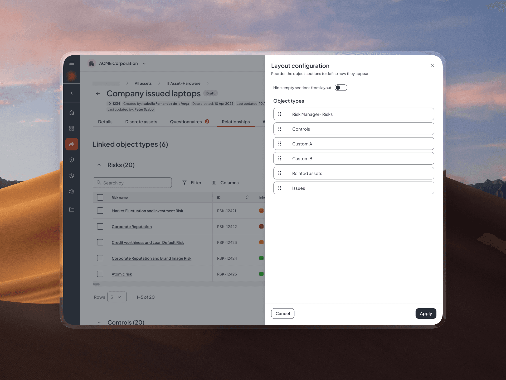
Reordering the layout
Why this direction:
The selected direction gave users more control and visibility when working with relationships, removing the key limitations of the previous experience:
New structure — expandable tables
New linking method
A new way to see related objects
Reordering the layout
Why this direction:
The selected direction gave users more control and visibility when working with relationships, removing the key limitations of the previous experience:
New structure — expandable tables
New linking method
A new way to see related objects
Reordering the layout
Decision points
More context during linking
Users are no longer limited to names and IDs — additional attributes help them identify the right entities with confidence.
Improved overview at scale
More information can be surfaced without overwhelming the layout, helping users maintain clarity even with larger datasets.
Faster navigation
An anchor navigation at the top helps users quickly jump between sections when multiple entity types are present.
Better visibility and filtering
The table layout allows more attributes to be displayed and filtered, making it easier to narrow down and compare results.
Flexible structure
Users can collapse sections and reorder them based on their priorities, adapting the experience to their workflow.
Decision points
More context during linking
Users are no longer limited to names and IDs — additional attributes help them identify the right entities with confidence.
Better visibility and filtering
The table layout allows more attributes to be displayed and filtered, making it easier to narrow down and compare results.
Improved overview at scale
More information can be surfaced without overwhelming the layout, helping users maintain clarity even with larger datasets.
Flexible structure
Users can collapse sections and reorder them based on their priorities, adapting the experience to their workflow.
Faster navigation
An anchor navigation at the top helps users quickly jump between sections when multiple entity types are present.
Decision points
More context during linking
Users are no longer limited to names and IDs — additional attributes help them identify the right entities with confidence.
Better visibility and filtering
The table layout allows more attributes to be displayed and filtered, making it easier to narrow down and compare results.
Improved overview at scale
More information can be surfaced without overwhelming the layout, helping users maintain clarity even with larger datasets.
Flexible structure
Users can collapse sections and reorder them based on their priorities, adapting the experience to their workflow.
Faster navigation
An anchor navigation at the top helps users quickly jump between sections when multiple entity types are present.
The impact
Adoption increased measurably after launch, with consistently positive feedback from users across teams.
Following launch, adoption of the feature increased, and feedback gathered through follow-up conversations was consistently positive — teams described it as a meaningful improvement to how they worked with connected data day to day.
Increased feature adoption
Usage of the relationships view increased after the redesign, with more users returning to it as part of their regular workflow.
Higher interaction with data
Users engaged more with filtering, navigation, and attribute-based exploration — indicating that the experience better supports real tasks.
Faster and more confident linking
Providing additional context during linking reduced ambiguity and helped users complete actions with greater confidence.
Improved efficiency in large datasets
Users were able to navigate and understand complex relationship data with less effort, especially in high-volume scenarios.
The impact
Adoption increased measurably after launch, with consistently positive feedback from users across teams.
Following launch, adoption of the feature increased, and feedback gathered through follow-up conversations was consistently positive — teams described it as a meaningful improvement to how they worked with connected data day to day.
Increased feature adoption
Usage of the relationships view increased after the redesign, with more users returning to it as part of their regular workflow.
Higher interaction with data
Users engaged more with filtering, navigation, and attribute-based exploration — indicating that the experience better supports real tasks.
Faster and more confident linking
Providing additional context during linking reduced ambiguity and helped users complete actions with greater confidence.
Improved efficiency in large datasets
Users were able to navigate and understand complex relationship data with less effort, especially in high-volume scenarios.
The impact
Adoption increased measurably after launch, with consistently positive feedback from users across teams.
Following launch, adoption of the feature increased, and feedback gathered through follow-up conversations was consistently positive — teams described it as a meaningful improvement to how they worked with connected data day to day.
Increased feature adoption
Usage of the relationships view increased after the redesign, with more users returning to it as part of their regular workflow.
Higher interaction with data
Users engaged more with filtering, navigation, and attribute-based exploration — indicating that the experience better supports real tasks.
Faster and more confident linking
Providing additional context during linking reduced ambiguity and helped users complete actions with greater confidence.
Improved efficiency in large datasets
Users were able to navigate and understand complex relationship data with less effort, especially in high-volume scenarios.