Turning a Flat Schedule into a Board-Ready Audit Plan

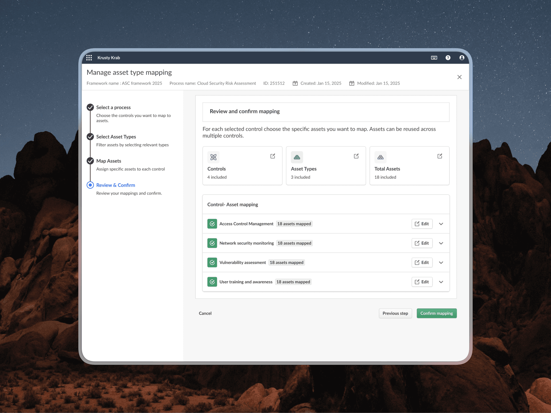
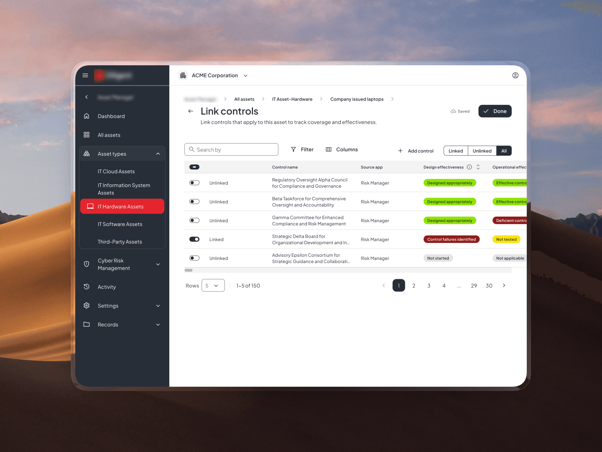
Enterprise relationship management dashboard showing link controls and connected entities across fragmented systems.

Role

Product Designer

Role

Product Designer

Year

2026

Year

2026

Category

Web, Saas

Category

Web, Saas

Overview

Internal audit teams plan their entire year of work inside a single timeline, the Audit Plan. It's the artifact a Head of Audit uses to show an audit committee what's covered, what's at risk, and when.

But the existing timeline could only do one thing: show when audits happened. It couldn't show whether the plan actually covered the risks that mattered.

I led the end-to-end design of Swimlanes and Milestones: a structural rework of the audit plan timeline that turned a flat scheduling list into a strategic, board-ready coverage view. I owned the work from early concept validation through final visual design, a cross-team design system fix, and post-launch dev support.

The problem

Audit Planning is where audit teams decide what gets audited and when. The timeline was the single source of truth for that plan, but it only supported basic scheduling.


Audits appeared as a flat list of bars. That was enough to answer "when is this happening," but not the questions that actually mattered to leadership:

Which risk domains are covered and which aren't?

-What critical dates (regulatory deadlines, committee meetings, phase gates) are coming up?

-Where is work running in parallel, and where are teams likely to collide?

Without this, Heads of Audit were doing the coverage analysis manually outside the product, in spreadsheets or slides, just to prepare for committee reporting.

Audit Planning is where audit teams decide what gets audited and when. The timeline was the single source of truth for that plan,but it only supported basic scheduling.


Audits appeared as a flat list of bars. That was enough to answer "when is this happening," but not the questions that actually mattered to leadership:

Which risk domains are covered and which aren't?

-What critical dates (regulatory deadlines, committee meetings, phase gates) are coming up?

-Where is work running in parallel, and where are teams likely to collide?

Without this, Heads of Audit were doing the coverage analysis manually outside the product, in spreadsheets or slides just,to prepare for committee reporting.

Audit Planning is where audit teams decide what gets audited and when. The timeline was the single source of truth for that plan,but it only supported basic scheduling.


Audits appeared as a flat list of bars. That was enough to answer "when is this happening," but not the questions that actually mattered to leadership:


-Which risk domains are covered and which aren't?

-What critical dates (regulatory deadlines, committee meetings, phase gates) are coming up?

-Where is work running in parallel, and where are teams likely to collide?

Without this, Heads of Audit were doing the coverage analysis manually outside the product, in spreadsheets or slides just,to prepare for committee reporting.

The problem source

This wasn't a hypothesis. It came directly from user testing and repeated feedback from Early Access Program (EAP) customers, who were explicitly asking for more structure in the timeline.

This wasn't a hypothesis. It came directly from user testing and repeated feedback from Early Access Program (EAP) customers, who were explicitly asking for more structure in the timeline.

This wasn't a hypothesis. It came directly from user testing and repeated feedback from Early Access Program (EAP) customers, who were explicitly asking for more structure in the timeline.

Target personas

Who This Was For

-Head of Audit (primary/strategic): owns the plan at a governance level. Needs to communicate coverage and risk exposure to the audit committee without manual rework.

-Audit Managers & Senior Auditors (operational): run the timeline day-to-day. Need to understand how audits move through phases and where work overlaps.

Designing for both meant the timeline had to work as a reporting surface and a working tool — at the same time, without becoming cluttered.

man wearing black suit

The process

Fast Exploration, Then Deliberate Design
Starting with AI, deliberately

I picked this up during an internal AI Building Day with PM and engineering. The scope was well-suited to it, the user need was already validated, and the interaction model was contained enough to explore quickly.

AI got us from zero to a first UI direction fast, and it did real work: it helped the team align on the job-to-be-done before a single Figma file existed.

But it also had a ceiling. As we kept iterating, the AI-generated UI started to destabilize.. elements shifted, labels broke, structure became inconsistent under edge cases. That instability was the signal that the remaining 30% of the work needed deliberate design judgment, not more generation.

But it also had a ceiling. As we kept iterating, the AI-generated UI started to destabilize.. elements shifted, labels broke, structure became inconsistent under edge cases. That instability was the signal that the remaining 30% of the work needed deliberate design judgment, not more generation.

Multiple enterprise interface concepts showing relationship management tables, linked controls, and configurable layouts.

AI output in the beggining

Moving into Figma: resolving the hard decisions

From there, I took the work through structured design iteration, working through the decisions that actually determine whether a timeline like this holds up in production:

1

Swimlane model

What counts as a lane; how lanes are created, edited, reordered

3

Coloring strategy

What color communicates (status vs. category vs. phase) — and what to deliberately avoid overloading

5

Uncategorized area

A deliberate holding space so audits don't need to be grouped immediately

7

Information density

What's always visible vs. revealed on hover/detail view

2

Milestones

What a milestone represents, where it lives on the timeline, full CRUD behavior

4

Label readability

Preventing label collapse on short-duration audits

6

Drag and drop rules

Audit-to-lane assignment, reordering, and constraints

8

Accessibility

Contrast and legibility across timeline items and milestone markers

Moving into Figma: resolving the hard decisions

From there, I took the work through structured design iteration, working through the decisions that actually determine whether a timeline like this holds up in production:

1

Swimlane model

What counts as a lane; how lanes are created, edited, reordered

2

Milestones

What a milestone represents, where it lives on the timeline, full CRUD behavior

3

Coloring strategy

What color communicates (status vs. category vs. phase) — and what to deliberately avoid overloading

4

Label readability

Preventing label collapse on short-duration audits

5

Uncategorized area

A deliberate holding space so audits don't need to be grouped immediately

6

Drag and drop rules

Audit-to-lane assignment, reordering, and constraints

7

Information density

What's always visible vs. revealed on hover/detail view

8

Accessibility

Contrast and legibility across timeline items and milestone markers

Moving into Figma: resolving the hard decisions

From there, I took the work through structured design iteration, working through the decisions that actually determine whether a timeline like this holds up in production:

1

Swimlane model

What counts as a lane; how lanes are created, edited, reordered

2

Milestones

What a milestone represents, where it lives on the timeline, full CRUD behavior

3

Coloring strategy

What color communicates (status vs. category vs. phase) — and what to deliberately avoid overloading

4

Label readability

Preventing label collapse on short-duration audits

5

Uncategorized area

A deliberate holding space so audits don't need to be grouped immediately

6

Drag and drop rules

Audit-to-lane assignment, reordering, and constraints

7

Information density

What's always visible vs. revealed on hover/detail view

8

Accessibility

Contrast and legibility across timeline items and milestone markers

Unblocking through a design system fix, and iterating past the first draft

Mid-project, I hit a real constraint: the existing Gantt chart component in the design system wasn't flexible enough to support short-duration audits without labels disappearing.

The first iteration also surfaced two other problems in design review. Lane colors and status colors were both drawing from a similar palette, so a lane like "Operational" and a status badge like "In progress" could both read as green, making it unclear whether a color meant which lane or what status. I had to separate those two systems so they wouldn't be read as the same signal.

The Uncategorized section needed a visibility decision too. Showing it prominently by default risked implying that categorization was mandatory, which wasn't the intent, since many teams may not use swimlanes at all. I designed it so the Uncategorized view only becomes prominent once a user creates their first category, keeping the experience unchanged for teams that don't opt in.

For the underlying component limitation, I brought the requirement to the design system team, aligned on the gap, and helped land a more flexible Gantt structure, fixing the immediate problem and making the system more capable for whatever timeline work comes next.

Multiple enterprise interface concepts showing relationship management tables, linked controls, and configurable layouts.

One of the first iteration (short audits on the timeline were a problem)

Unblocking through a design system fix, and iterating past the first draft

Mid-project, I hit a real constraint: the existing Gantt chart component in the design system wasn't flexible enough to support short-duration audits without labels disappearing.

The first iteration also surfaced two other problems in design review. Lane colors and status colors were both drawing from a similar palette, so a lane like "Operational" and a status badge like "In progress" could both read as green, making it unclear whether a color meant which lane or what status. I had to separate those two systems so they wouldn't be read as the same signal.

The Uncategorized section needed a visibility decision too. Showing it prominently by default risked implying that categorization was mandatory, which wasn't the intent, since many teams may not use swimlanes at all. I designed it so the Uncategorized view only becomes prominent once a user creates their first category, keeping the experience unchanged for teams that don't opt in.

For the underlying component limitation, I brought the requirement to the design system team, aligned on the gap, and helped land a more flexible Gantt structure, fixing the immediate problem and making the system more capable for whatever timeline work comes next.

Multiple enterprise interface concepts showing relationship management tables, linked controls, and configurable layouts.

One of the first iteration (short audits on the timeline were a problem)

Unblocking through a design system fix, and iterating past the first draft

Mid-project, I hit a real constraint: the existing Gantt chart component in the design system wasn't flexible enough to support short-duration audits without labels disappearing.

The first iteration also surfaced two other problems in design review. Lane colors and status colors were both drawing from a similar palette, so a lane like "Operational" and a status badge like "In progress" could both read as green, making it unclear whether a color meant which lane or what status. I had to separate those two systems so they wouldn't be read as the same signal.

The Uncategorized section needed a visibility decision too. Showing it prominently by default risked implying that categorization was mandatory, which wasn't the intent, since many teams may not use swimlanes at all. I designed it so the Uncategorized view only becomes prominent once a user creates their first category, keeping the experience unchanged for teams that don't opt in.

For the underlying component limitation, I brought the requirement to the design system team, aligned on the gap, and helped land a more flexible Gantt structure, fixing the immediate problem and making the system more capable for whatever timeline work comes next.

Multiple enterprise interface concepts showing relationship management tables, linked controls, and configurable layouts.

One of the first iteration (short audits on the timeline were a problem)

The Solution

The rebuilt timeline replaced a flat audit list with two additions that changed what the plan could communicate:

-Swimlanes : group audits by risk domain, business unit, audit type, or assurance provider, so coverage (and coverage gaps) are visible at a glance.

-Milestones : visible markers for the dates that actually drive audit work: committee meetings, regulatory deadlines, phase gates, remediation due dates.

The interaction model was intentionally manual-first: users create, edit, reorder, and assign everything themselves. This made the feature immediately useful on day one, and established the structural foundation for what came next.

Multiple enterprise interface concepts showing relationship management tables, linked controls, and configurable layouts.

Before

The structure was Flat Gantt-style list, status labels, budgeted hours only

Coverage visibility was not answerable in-product

Key dates not represented on the timeline

Primary value was scheduling

Multiple enterprise interface concepts showing relationship management tables, linked controls, and configurable layouts.

After

Now the structure is swimlane-organized, with milestone markers for key dates

Coverage visibility: Immediately visible by risk domain, business unit, or audit type

Visible explicit markers for deadlines, gates, and committee dates

Values: Governance, coverage communication, operational coordination

Multiple enterprise interface concepts showing relationship management tables, linked controls, and configurable layouts.

Before

The structure was Flat Gantt-style list, status labels, budgeted hours only

Coverage visibility was not answerable in-product

Key dates not represented on the timeline

Primary value was scheduling

Multiple enterprise interface concepts showing relationship management tables, linked controls, and configurable layouts.

After

Now the structure is swimlane-organized, with milestone markers for key dates

Coverage visibility: Immediately visible by risk domain, business unit, or audit type

Visible explicit markers for deadlines, gates, and committee dates

Values: Governance, coverage communication, operational coordination

Multiple enterprise interface concepts showing relationship management tables, linked controls, and configurable layouts.

Before

The structure was Flat Gantt-style list, status labels, budgeted hours only

Coverage visibility was not answerable in-product

Key dates not represented on the timeline

Primary value was scheduling

Multiple enterprise interface concepts showing relationship management tables, linked controls, and configurable layouts.

After

Now the structure is swimlane-organized, with milestone markers for key dates

Coverage visibility: Immediately visible by risk domain, business unit, or audit type

Visible explicit markers for deadlines, gates, and committee dates

Values: Governance, coverage communication, operational coordination

Designing for What Comes Next

The manual-first approach wasn't just a scoping decision for launch, it was a deliberate architectural choice. I designed the swimlane and milestone structure to be scalable and flexible enough to support AI-assisted planning later, without requiring a rebuild.

Structured, addressable data model, swimlane categories and milestones are explicit objects, not just visual groupings, so an AI system can reason about them, suggest them, or auto-populate them later

A clear manual baseline: because users can fully control the structure by hand today, any future AI suggestion is additive, not a replacement they have to blindly trust

This matters because the roadmap for Audit Planning includes AI-assisted plan generation, auto-suggesting swimlane groupings, flagging coverage gaps, or recommending milestone placement based on risk data. Rather than treating that as a separate future project, I designed the current structure so it can absorb that capability without a redesign.

This matters because the roadmap for Audit Planning includes AI-assisted plan generation, auto-suggesting swimlane groupings, flagging coverage gaps, or recommending milestone placement based on risk data. Rather than treating that as a separate future project, I designed the current structure so it can absorb that capability without a redesign.

Multiple enterprise interface concepts showing relationship management tables, linked controls, and configurable layouts.

First iteration: manual category creation, with an "AI suggestion" entry point built in.

Multiple enterprise interface concepts showing relationship management tables, linked controls, and configurable layouts.

AI analyzing historical audit data to identify category patterns.

Multiple enterprise interface concepts showing relationship management tables, linked controls, and configurable layouts.

Result: AI-suggested categories with reasoning, user reviews and confirms.
The impact

Swimlanes and Milestones shipped as a core part of the Audit Planning experience, the same experience through which most new Audit customers form their first impression of the product.

While usage data isn't broken out at the individual feature level, the module-wide numbers from the period following launch give useful context for where this work sits:

Account retention

-New account retention: 82.5% (+32%) of newly onboarded accounts, over 8 in 10 formed a habit and returned within their first 30 days, in a module where Swimlanes and Milestones is now a primary planning surface

-Account-level retention: 82.9% (+7.5%) — established accounts continued relying on the module month-over-month, despite a large influx of new, less-familiar users

-10,611 feature interactions recorded across the Audit area in the same period, indicating active, ongoing use rather than a one-time look

Beyond the numbers

-Directly resolved feedback raised independently by multiple EAP customers during testing

-Eliminated the need for Heads of Audit to rebuild coverage views manually outside the product for committee reporting

-Improved the underlying design system's Gantt component, reducing rework for any future timeline-based feature

-Built on an architecture designed to support AI-assisted planning as a natural next phase, not a future rebuild

The impact

Swimlanes and Milestones shipped as a core part of the Audit Planning experience, the same experience through which most new Audit customers form their first impression of the product.

While usage data isn't broken out at the individual feature level, the module-wide numbers from the period following launch give useful context for where this work sits:

Account retention

-New account retention: 82.5% (+32%) of newly onboarded accounts, over 8 in 10 formed a habit and returned within their first 30 days, in a module where Swimlanes and Milestones is now a primary planning surface

-Account-level retention: 82.9% (+7.5%) — established accounts continued relying on the module month-over-month, despite a large influx of new, less-familiar users

-10,611 feature interactions recorded across the Audit area in the same period, indicating active, ongoing use rather than a one-time look

Beyond the numbers

-Directly resolved feedback raised independently by multiple EAP customers during testing

-Eliminated the need for Heads of Audit to rebuild coverage views manually outside the product for committee reporting

-Improved the underlying design system's Gantt component, reducing rework for any future timeline-based feature

-Built on an architecture designed to support AI-assisted planning as a natural next phase, not a future rebuild

The impact

Swimlanes and Milestones shipped as a core part of the Audit Planning experience, the same experience through which most new Audit customers form their first impression of the product.

While usage data isn't broken out at the individual feature level, the module-wide numbers from the period following launch give useful context for where this work sits:

Account retention

-New account retention: 82.5% (+32%) of newly onboarded accounts, over 8 in 10 formed a habit and returned within their first 30 days, in a module where Swimlanes and Milestones is now a primary planning surface

-Account-level retention: 82.9% (+7.5%) — established accounts continued relying on the module month-over-month, despite a large influx of new, less-familiar users

-10,611 feature interactions recorded across the Audit area in the same period, indicating active, ongoing use rather than a one-time look

Beyond the numbers

-Directly resolved feedback raised independently by multiple EAP customers during testing

-Eliminated the need for Heads of Audit to rebuild coverage views manually outside the product for committee reporting

-Improved the underlying design system's Gantt component, reducing rework for any future timeline-based feature

-Built on an architecture designed to support AI-assisted planning as a natural next phase, not a future rebuild

Reflection

My reflection is that AI was genuinely valuable in the first mile: it collapsed the time from blank page to shared understanding across PM, engineering, and design.

But it hit a hard ceiling once the work required stability, edge-case handling, and pixel-level judgment, the things that make a feature trustworthy in a compliance-critical product. And it shaped how I designed the final structure itself: not just to solve today's problem, but to stay open for the AI-assisted capabilities coming next.

AI helped us start fast. Design judgment made it real,and made it ready for what's next.

Reflection

My reflection is that AI was genuinely valuable in the first mile: it collapsed the time from blank page to shared understanding across PM, engineering, and design.

But it hit a hard ceiling once the work required stability, edge-case handling, and pixel-level judgment, the things that make a feature trustworthy in a compliance-critical product. And it shaped how I designed the final structure itself: not just to solve today's problem, but to stay open for the AI-assisted capabilities coming next.

AI helped us start fast. Design judgment made it real,and made it ready for what's next.

Reflection

My reflection is that AI was genuinely valuable in the first mile: it collapsed the time from blank page to shared understanding across PM, engineering, and design.

But it hit a hard ceiling once the work required stability, edge-case handling, and pixel-level judgmend, the things that make a feature trustworthy in a compliance-critical product. And it shaped how I designed the final structure itself: not just to solve today's problem, but to stay open for the AI-assisted capabilities coming next.

AI helped us start fast. Design judgment made it real,and made it ready for what's next.

Based in: Budapest, Hungary

Available for: Freelance and full time opportunities

Available for: Freelance and Full Time opportunities

Open to meaningful work

Open to meaningful work

Open to meaningful work

Made with Framer

Made with Framer

Create a free website with Framer, the website builder loved by startups, designers and agencies.